Dan Abney's Portfolio
Design Tools
Here are some samples of the workflow mapping tools we use.

User Flow
This what we use to document the user's designed workflow. This worked well to describe what we want the user experience to be and allowed us to validate it with users.
One drawback was it only really shows the "happy path", and doesn't clearly explain what the system is expected to do as the user interacted. Development team members had challenges visualizing the software to build.
This was supposed to remain front and center when discussing the user's workflow, unfortunately, it often fades to the back when detailed discussions start. I intended to fix this.
Tech Flow

We reviewed the classic flow chart shapes...

Then we thought to separate the user's actions from the system actions and add some color channels, and tried to keep a "Sense of passing time" (Keep the user Productive)
Our dev teams appreciated this diagram specifically, as they could get a lot of use from it, including:
- At a glance, they could count how many screens they needed.
- Have a better understanding of the logic behind the design
- They could more accurately provide time estimates for features.
We received some feedback that the teams weren't clear on what would happen if the user "goes off the happy path". While we may have thought about more scenarios in the design, it wasn't apparently in our stand-ups.
We looked at flow chart tools like "Visio", but we thought it was still important to maintain a clear presentation of the "happy path", as well as a strong sense of passing time.

Team Flow

During our ideation sessions, we became inspired by metro maps that are seen in and around metro stations. They show how the trains are connected as they help move people along to their destinations.

... We explored this concept ...
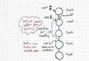
... made it vertical ...
As some projects started to get more complex with multiple personas involved, we needed a way to show, at a higher level, what larger groups of users were doing to accomplish their collective goals.

The Team flow